A new season is approaching, and we have new color trends by Pantone Insitute. As it started two seasons ago, we have two Color Trend Reports, one for NY Fashion Week and the other for London Fashion Week. To make things simple we will cover both but in separate posts.
In this one we will talk about Pantone Fashion Color Trend Report for NY Fashion Week.
The report includes two different palettes: one with the bold colors and the other one with the classic and neutral tones.
The main characteristics of these trendiest colors are the creativity and the unexpected shades for a traditional autumnal palette. By mixing and matching some unexpected colors you can have personal and astonishing looks.
We will begin with the most innovative tones to continue with the classic ones.
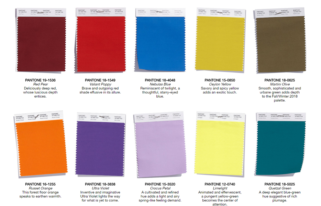
About the top ten Color Palette we can see it is inspired in the fallen leaves on the forest floor, birds plumage and fall incandescent sunsets. Rich and deep colors that will surprise you.

Here you have them:
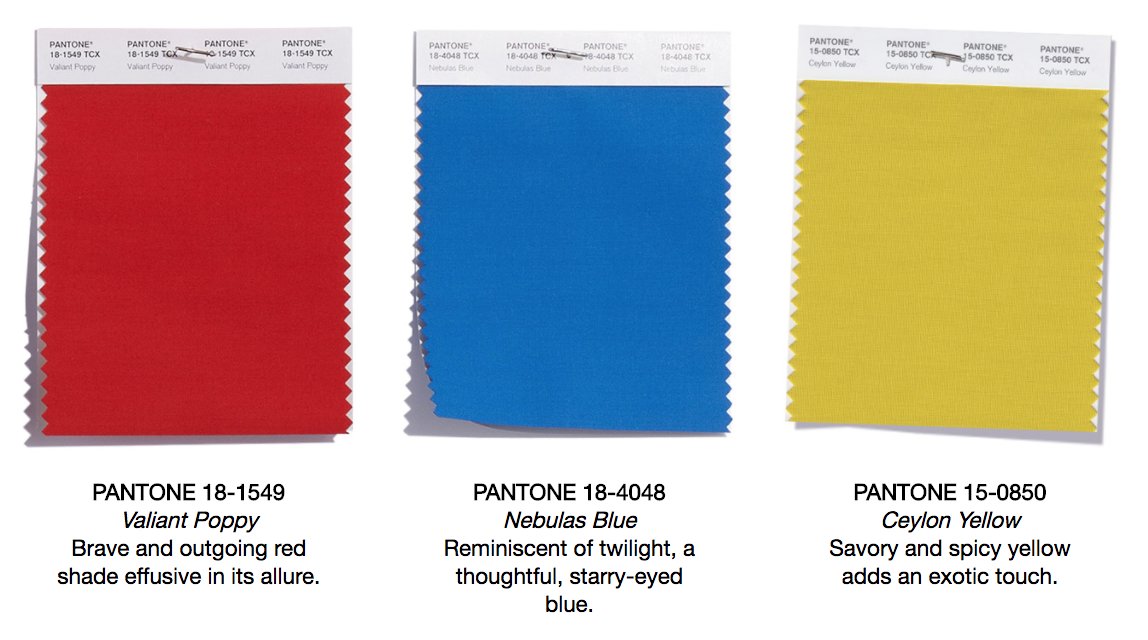
Red Pear is a deep red with seductive memories to the autumnal red leaves.


Valiant Poppy could be one of my favorite colors for its rich intensity and the optimism it transmits.


Nebulas blue is inspired by Fall sunsets with a kind and romantic background. Another positive and vibrant shade to cheer up your wardrobe.


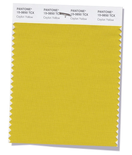
Ceylon Yellow reminds to curry and other spices giving an exotic enthusiasm to your looks.

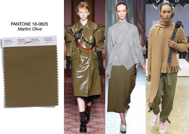
Martini olive is a more muted tone. However, it looks sophisticated and cosmopolitan paired with many of the vibrant shades as well as elegant on its own or with one of the neutrals.

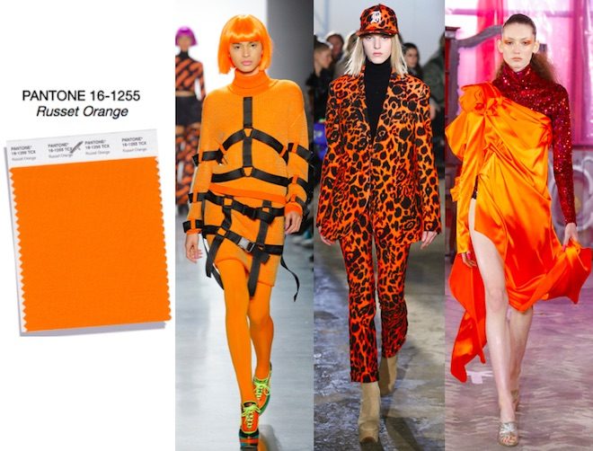
Russet orange is warm and flashy, a splendorous way to infuse good vibrations to your looks.

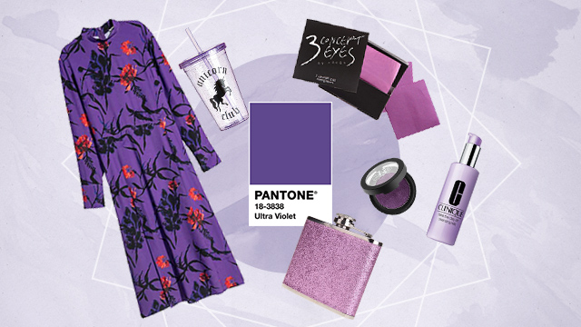
Ultra Violet is the color of the year. IT was present in the Spring and Color Report and offers a combination of magic charm and originality.

Crocus Petal is a classy and luminous shade which injects spring vibes in your fall wardrobe.


Limelight is a yellow green tone which adds sparkle and luminosity.


Quetzal green could be considered as a blue – green tone synonym of elegance, sophistication and refinement.


To conclude we have the so called Classic Palette made up of the following five hues:
Sargasso Sea is a very deep and infinite blue anchoring and connecting well both palettes.


Tofu is defined as a creamy white, another classic to inject refinement.

Almond Buff is in the family of the camel hues and it is a natural and delicate tone.


Quiet Gray sounds soft, silky and smooth. A cute light grey easy to match.


Meerkat is in the family of the browns. A polished and furbish brown.


These Classic shades are the transition colors between seasons and make blending and mixing easier.

With this review you can begin to organize your next season wardrobe. Which hue is your favorite?
How do you like the vibrant colors?
See you in the next one. Blessings.