
According to Pantone Institute the color palette for autumn/winter 2020/2021 for London Fashion Week reflects versatility, vibrancy, and power. It is a mixture of energy and serenity. Here you have the hues that make the core of the palette:

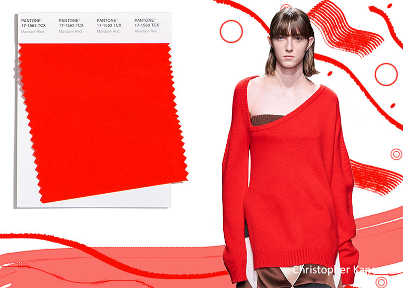
Mandarin Red
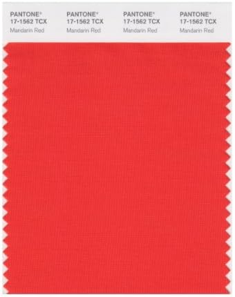
An energetic orangy red shade, this tone infuses strength and optimism to your outfits.
Samba

Samba can be defined as a sensual red full of energy and enthusiasm. A good way to incorporate brilliance and excellence to more muted shades.

True blue
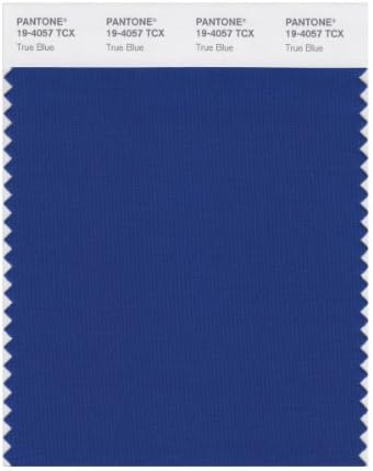
A classic blue shade, elegant, timeless, and sophisticated. A neutral to be paired with the more vibrant hues of the palette.

Exuberance

This orange tone transmits joy, cheerfulness, and liveliness, perfect to inject light to your wintery days.

Military Olive

A classic color for autumnal days, strong and powerful transmits empowerment and seriousness on its own but perfect to make daring combinations.

Celery

I describe it as a yellowish green which transmits brightness, shine and vigor to illuminate your autumnal looks.

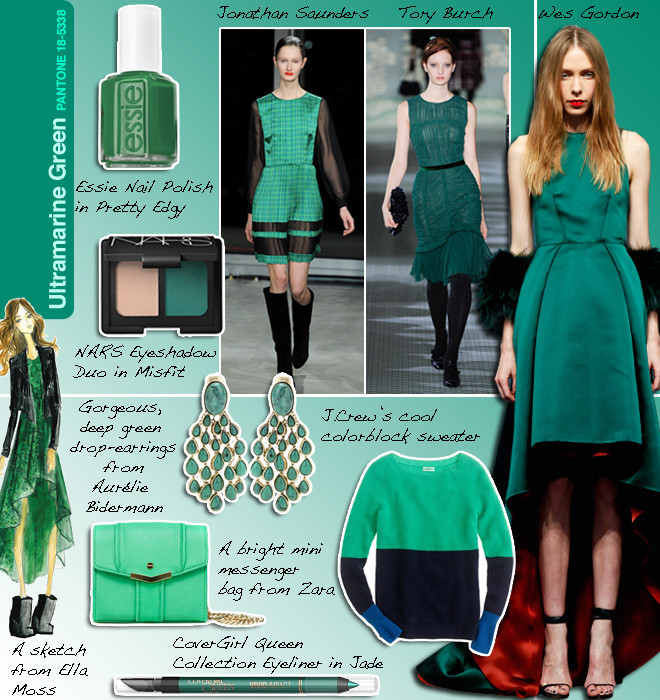
Ultramarine green

A powerful deep green tone which results elegant, classy and sumptuous in monochromatic combinations and also ideal to mix with more vibrant hues of the palette.
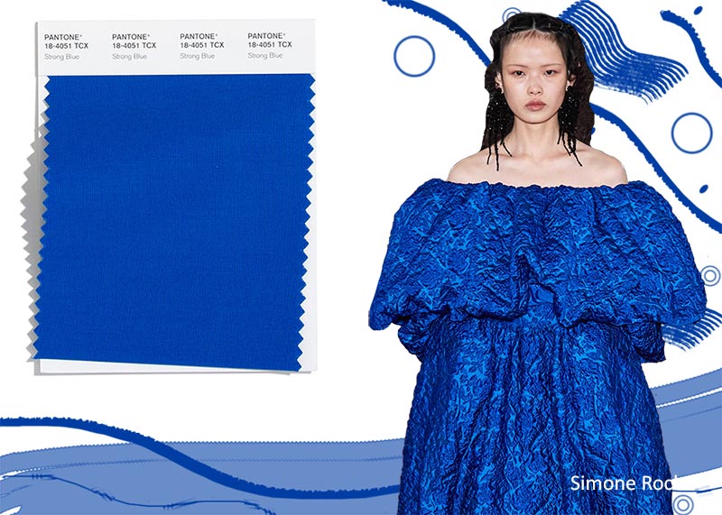
Strong Blue
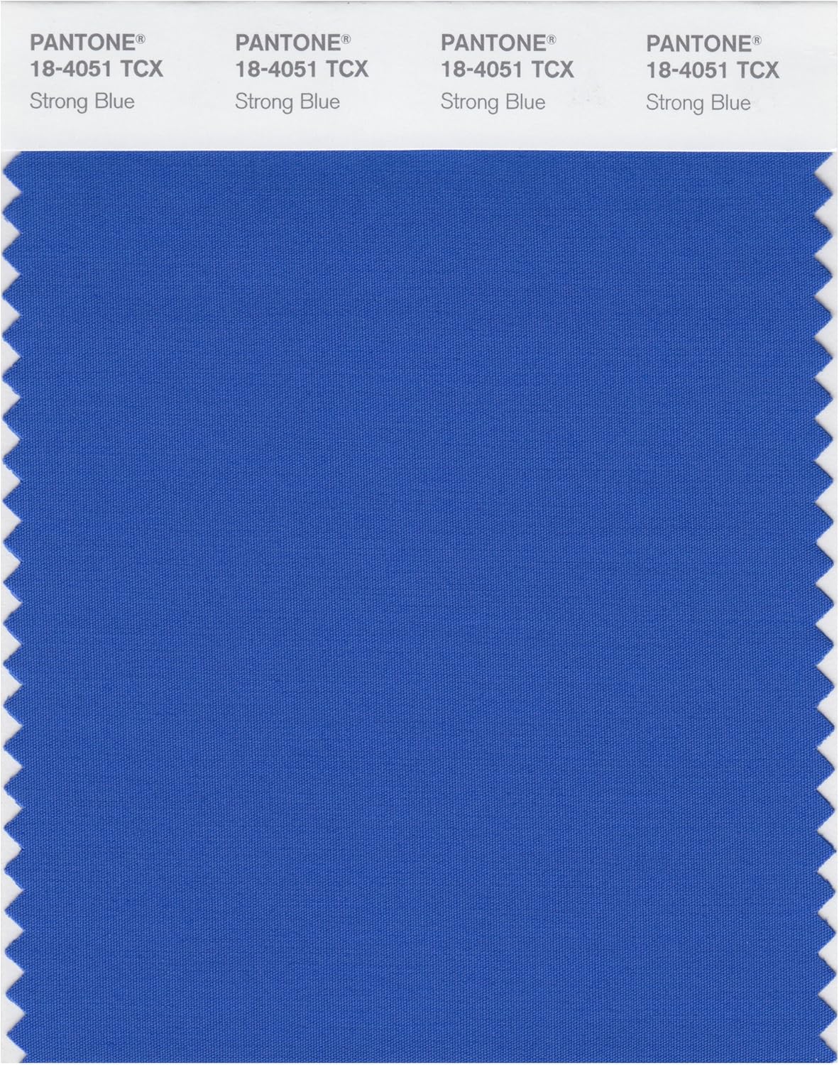
This shade has a red undertone giving confidence, optimism and energy to your outfits.
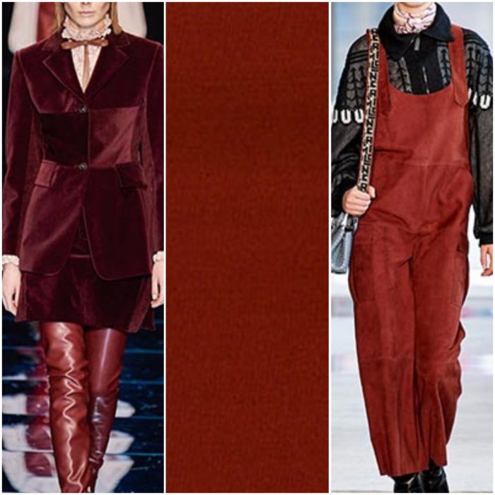
Burnt Henna

A solid red which exudes sophistication, wellness and refinement.
Tawny Birch

Natural, rocky and forest evoking tan hue which transmits elegance worn on its own but also perfect to tone down vibrant colors.

Which are your favorite shades? How would you mix and match them?
Peace and passion.
