When I presented the Spring 2018 New York Fashion Week Palette, I promised I will also review the London Fashion Week edition. I forgot to include the Classic Color Palette related to New York color forecast so I will redo the post to add this one. However, it has been included in this post.

Overall, I should say it is a colorful palette which combines masterfully flamboyant shades with muted tones and neutral shades. So mix and match colors at your wish but keep in mind that the shades included in the list will be the most popular next season.
Cherry Tomato
This is one of the shades in common with the New York palette. It is an orange based red which denotes energy and vitality. In a head to toe outfit looks daring but it can make an elegant combiation when paired with muted colors. Cherry tomato is a positive impact in your wardrobe when you want to paint the town in red.

Palace blue

This energetic shade results impressive and bright. It is also a nice complement to the Cherry tomato or other vivid colors in the palette. It is a color explosion when mixed with neutrals.
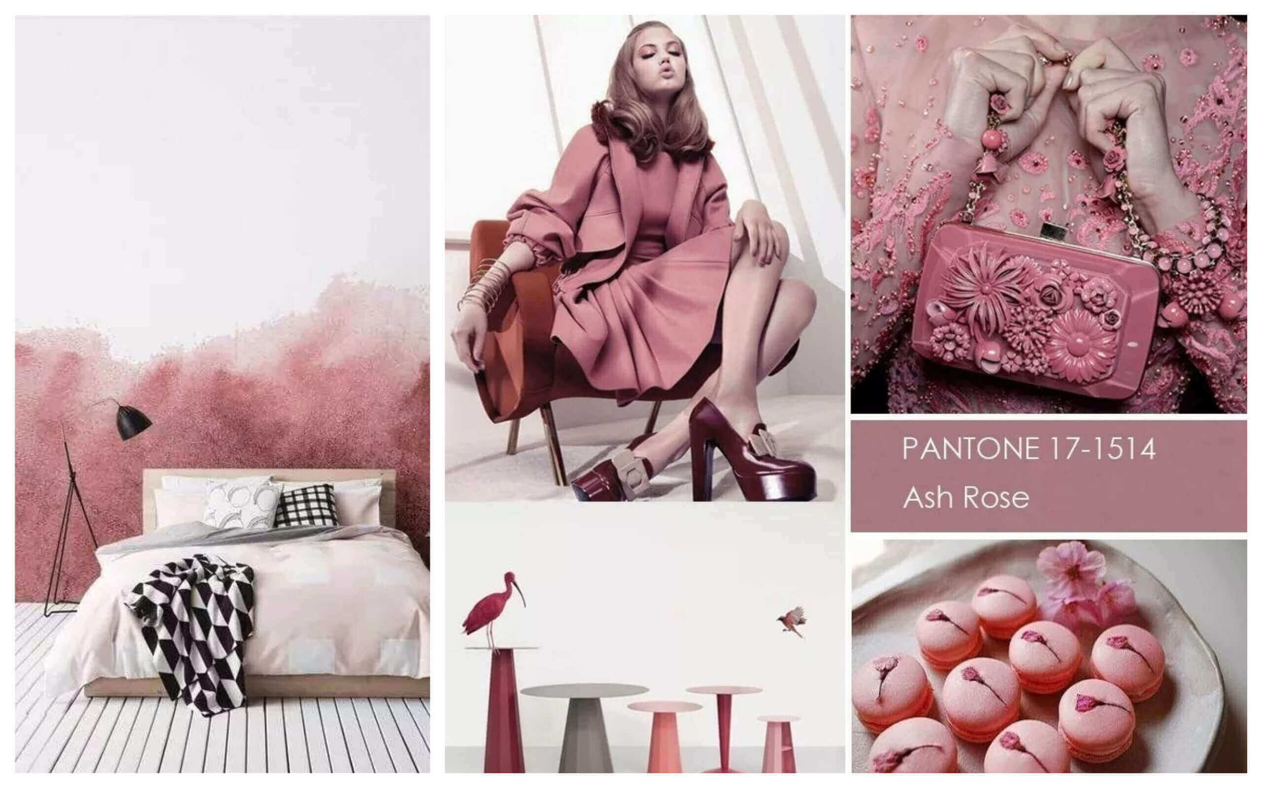
Ash Rose
For those who love sofistication, I recommend Ash Rose which is an earthy pink. This shade can be one of the neutrals in next spring color scheme, so it is good for accessorizing and for softening the deepest shades in the palette.

Nile Green
A tranquil and placid hue is Nile Green. This cheerful light green matches well with many of the shades in the Spring 2018 palette. Nile Green looks harmonious by itself and it can be used to balance coloful outfits.

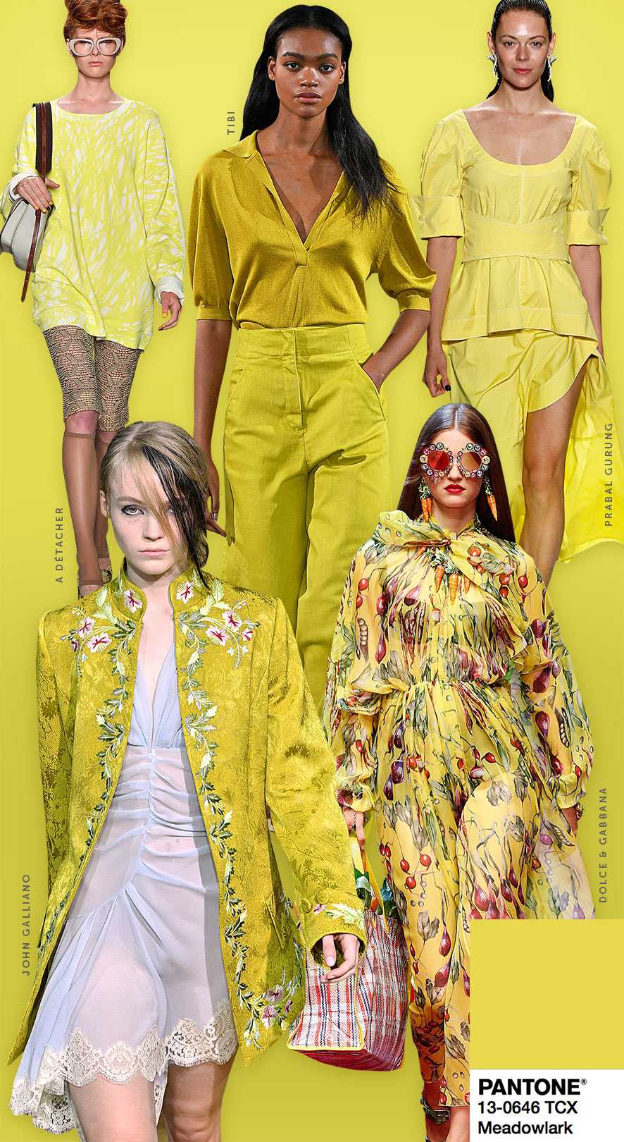
Meadowlark
Flamboyant Meadowlark is a yellow tone included in both palettes. It transmits the joy of the sunrays as well as it illuminates our looks with glamour and energy.

Blooming Dahlia
The happiness of the flowers into your wardrobe is what Blooming Dahlia represents. Girly, suggestive and flowery adds a wide spectrum to your outfits. A true genuine rose in the palette.

Ultra Violet
A chromatic combination of magic, originality and elegance is what ultra violet exudes. This shade also included in the NYFW palette is one of my favourites for its profundity and stateliness.

Spiced Apple
Brown is not by itself a summery color. However this brown with a red base is unique and adds a spicy touch to the Spring 2018 palette.

Pink Lavender
Pink Lavender can be described as a soft rose with a violet base. This is another romatic and soft color to brighten up your spring clothes.

Lime Punch
This citric shade looks garish and loud spicing the neutral shades with a splash of good vibrations. Do you dare to wear it in a monochrome look?

Almost Mauve
A gentle floral tone to inject tenderness and delicateness to your outfits. With this gentle shade you will feel girly and nostalgic.

Rapture Rose
Here we have another girly shade. Rapture Rose injects the romanticism and caress typical of the roses. This shade includes a red base which makes it more luminous

And now the neutrals or classic color palette. To nuance the palette you can use these core basic colors which link together both palettes.
Sailor Blue
It is a navy blue color considered a classy color to give a classic touch to your outfits.

Harbor Mist
A medium dove grey to soften the Spring 2018 palette.

Warm Sand
A classic footbridge to connect all seasons with an effortless neutral shade.

Coconut Milk
A mixture of white and off-white to complement and lighten the palette.

Which is your favorite shade? Do you prefer the neutrals or the vibrant shades?
Take care and have fun. See U in the next one.
Why u dont vote us?
https://superduque777.wordpress.com/
LikeLike
Votar no cuesta nada…
https://superduque777.wordpress.com/
LikeLike
Querido Superduque777, hemos citado y esperamos que obtengas el premio merecido. Es posible votar cada día ?
LikeLiked by 1 person
Solo publico semanalmente una sola entrada,
LikeLike
Bueno pues votaremos en cada nuevo post si está el indicador
LikeLiked by 1 person