As I told you in my previous Fall – Winter Pantone review this season we have two reports: one based on New York Fashion Week trends and the other focussed on the London Fashion Week. I reviewed the New York Fashion Week report and today I will comment the London´s palette.

Flame Scarlet is the most intense shade. It is a vivid and brilliant red which reminds the red leaves in november. It is a rich color pretty easy to combine.

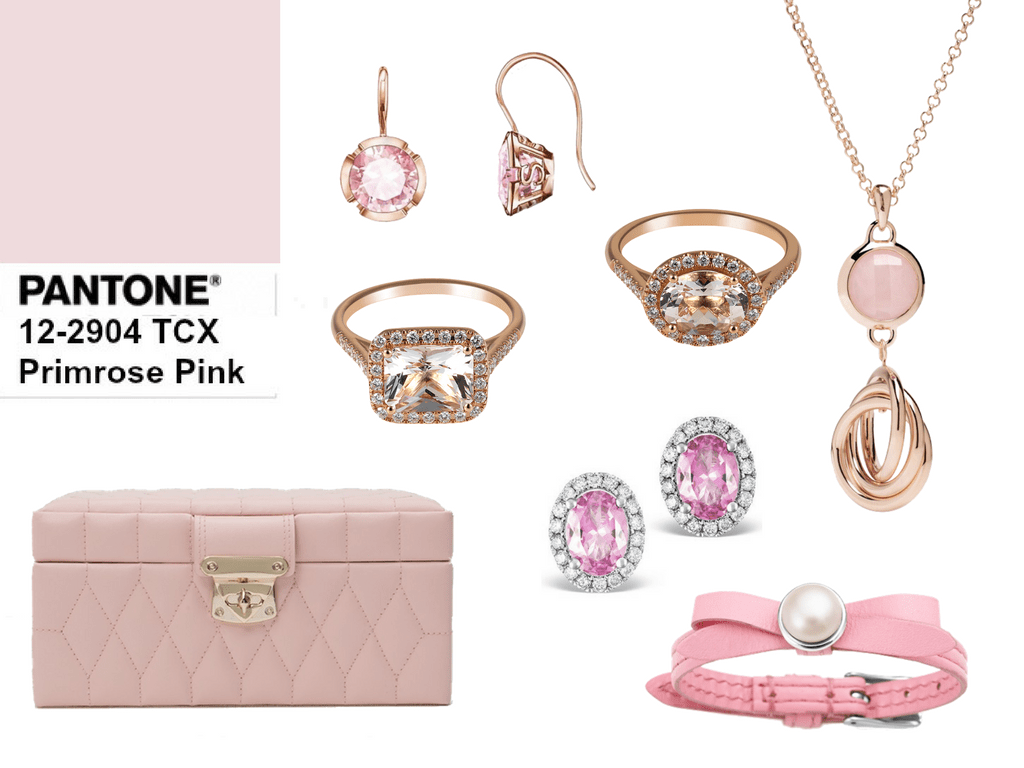
 Primrose Pink is a dusty pink which was very popular this spring known as Pale Dogwwod. A soft and girly pink which could be considered as a neutral. It can be worn on its own or combined with scarlet, bluebell and navy peony.

Toast is a warm beige which has the reminiscence of the autumnal nature. Another elegant neutral that could be used as a trasitional color in the palette.


Bluebell is a relaxing light blue wich transmits peace and calm. It is a vibrant color easy to pair with all the neutrals, the navy peony even though with royal lilac.

Royal Lilac is another rich color which complements with a theatrical linkage the other colors in the palette.


From the country to the city Otter brings a splash of earthy tones to the palette. This shade condenses the power of the earthy tones and could be used to relax the most vivid colors of the palette.


Navy Peony is a common shade for London and New York. It is a solid and stable color which contains some properties of the off-black and makes this intense dark blue more combinable and neutral.


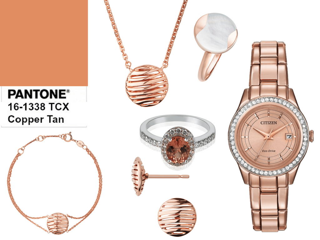
Copper Tan is another warm shade in the palette. Another burning tone with an earthy metallic base. Complements easily toast and other soft tones of the palette but also it pops up the darkest shades.

Lemmon Curry is a spicy touch with vibrant and refreshing connotations. A way to bright in the rainy and cloudy days of the winter.


Golden Olive is a majestic green close to the evergreen taiga forest with spruces and larches. A natural touch in your wardrobe.


After contrasting both palettes, which one is your favorite? What color will be the base of your wardrobe? Do you like the trendiest shades?
Have a nice day. Love and peace.

Well! Over the last couple years I added lots of primrose pink and bluebell to my wardrobe (I have a gorgeous sky blue purse by NY designer Christian Siriano…great price!, and a blush pink satchel in “alligator” vinyl that has a big petal shape on the front. You would probably try to wrestle me to the ground for these!). I always have at least two pair of red shoes. But clearly I am lacking in red tops! And I have to have a top in that Royal Lilac. So, two new purchases planned for later this year. It will be all your fault.
LikeLiked by 2 people
Genie Geer, your purse and your satchel seem to be really cute, not only for the shape but also for the texture and materials they are made of. And well if you like put the blam on me whe you will buy the red tops but, my friend, red is a classic and fits every women no matter they skin tone and complexion. My choice is always monochrome in red but sometimes I love to pair it with navy blue, white, pink or grey. As usual my love for pink and grey comes out but, in my opinion, these shades are neutrals.
On the other hand, Genie Geer Pantone report is a business and we can skip their trends although there are seasons you look for clothes in one shade and it looks as if it has dissapeared because you can´t find it. It happened to me last year with burgundy and this season is again on trend… In any case the best thing is to wear what we like, what fits our body and personality. Thanks again for your comments, I appreaciate them.
LikeLiked by 2 people
great post! Would love if you could check out and follow my blog https://missymjblog.wordpress.com/
LikeLike