Every season Pantone Color Institute issues its report on colors shown by fashion designers at New York Fashion Week. With the analysis of what designers offer in the runway Pantone releases their Color Fashion Report for the season containing the 10 dominant colors for the next season. For next fall and winter, Pantone Color Institute introduces innovations such as releasing two reports based on New York Fashion Week and London Fashion Week proposals. Then we will describe both in separate posts.

With this said, I comment my feelings on New York Fashion Week´s palette. I could describe it as founded on warmer color range with Grenadine and Golden Lime as the most vivid tones. Here you have the whole palette description:
Grenadine is a powerful red tone to have all eyes on you when you wear it. A total look in this shade requires a great self confidence.


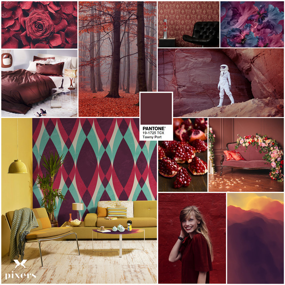
Tawny Port is in the family of the darker reds. This shade looks elegant and sophisticated and very useful and tasty to light up your looks.


Ballet Slipper is in the softer side of the reds. If you want to add a soft touch to your looks just wear this tender dusty rose. It reminds me to my mum´s cheek rosy glow.


Butterum is another warm color in the neutral spectrum. A toasty , earthy light brown to accompany the colors of the nature during the fall.


Navy Peony is a common shade for London and New York palettes. It is a solid and stable color which contains some properties of the off -black and makes it more combinable and neutral.


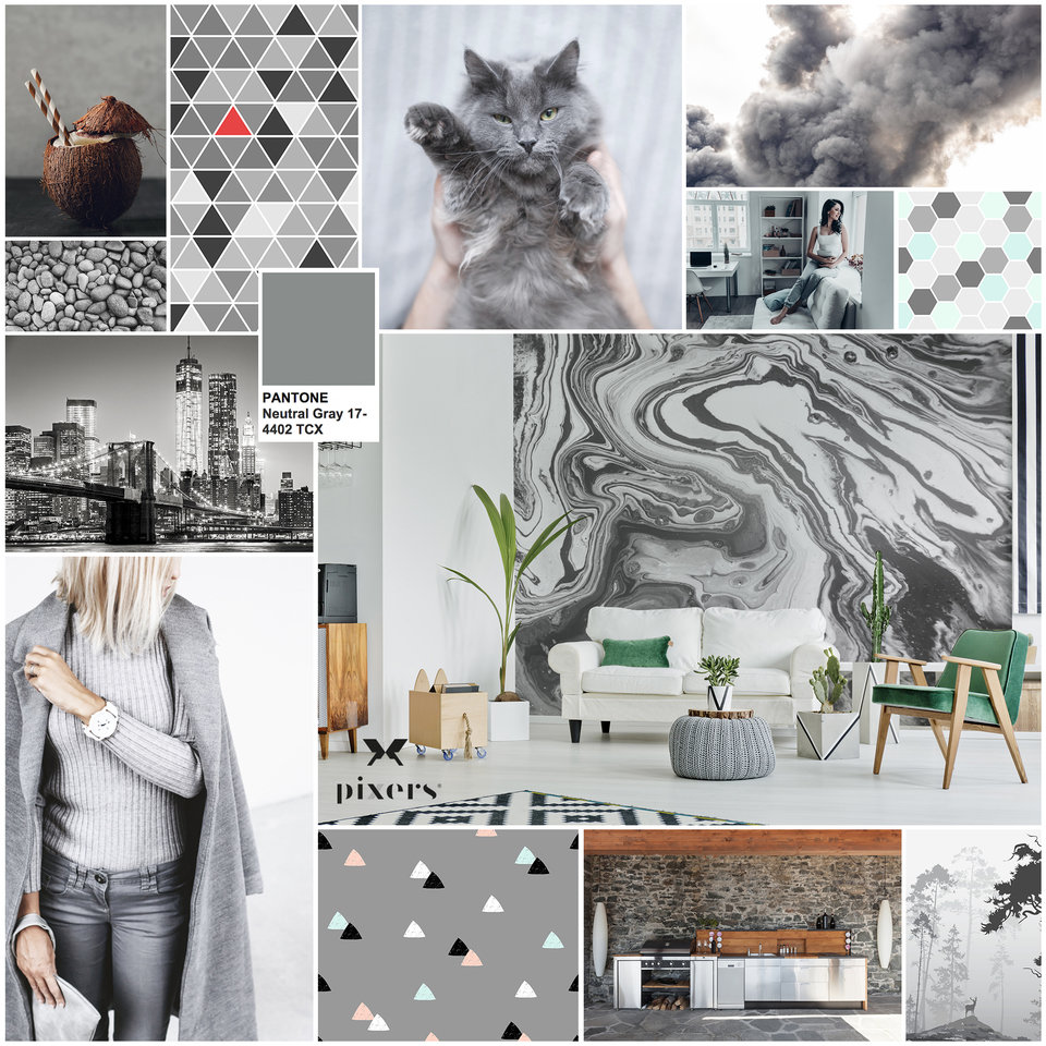
Neutral gray is with navy peony another transactional shade. It charges outfits with smart touch when used in combination of other tones or it can be a statement color when used in monochromatic looks.


Shaded spruce is an evergreen tone found in deep forests. A dark and versatile color to be in touch of autumnal nature.


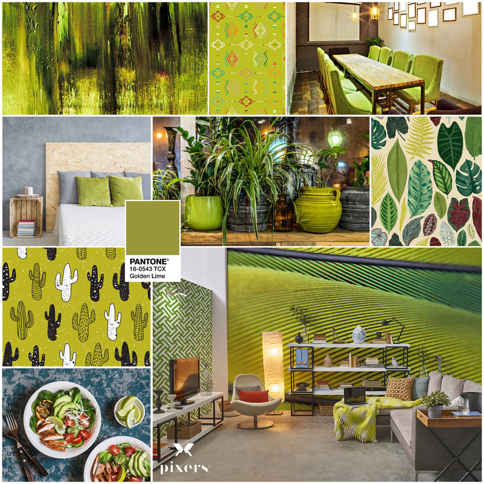
Golden lime is a refreshing shade for dark fall colours adding the golden accents of a green yellow tone.


Marina is characterized by the vitality and freshness of a true cold shade. It gives an excellence touch to all your outfits.
 Autumn maple is a tawny warm color, typical of the autumnal palette. Another neutral to infuse warmth to the darkest colors of the season.


And now some cute combinations using the fall 2017 -18 Pantone New York Edition.
For a classy touch mix navy peony, shaded spruce and golden lime or marina. If you prefer a retro sophisticated vibe use ballet slipper, butterrum and navy peony. Other cute combination could be tawny port, navy peony and shaded spruce, this one in the darkest side. For those who a more classical I suggest autumn Marple or grenadine plus navy peony and shaded spruce. In my case I love delicate combinations such as ballet slipper, neutral grey and butterum. And last but not least those who prefer nautical could mix grenadine, navy peony and marina.
Which is your favorite combination? How do you feel about the Fall 2017 Pantone? As usual I like to receive your feelings. See U soon. Love and peace