VITALITY AND GREAT OUTDOORS SCAPE
Before the year 2016 expires, we have an advance of the color trends for next season.
Every season, PANTONE teams with fashion designers to set an astonishing palette of colors for the brand-new collection. As an advance of what we will be wearing here you have the color guide for spring 2017. Fashion industry has begun to provide them in the transitioning collections so let´s review the 10 must have shades.
We can conclude it is a rich palette mixing vibrant colors with earthy shades, contrasting vivid colors with neutrals or for those more adventurous their proposal is a total look in one of the brighter shades. PANTONE representatives suggest that the inspiration for the new use of color can be found in nature in spring time. So, shades range from the sunshine and light to the freshness of the water and the nature in blossom with delicate and vivid flower colors or green grass.
After this short introduction, we describe the top colors:
PANTONE 17-4123 Niagara
It is a denim blue which will be the most prevalent color for spring 2017.
Comfortable and dependable, Niagara leads the PANTONE Fashion Color It reflects relaxation and ease.


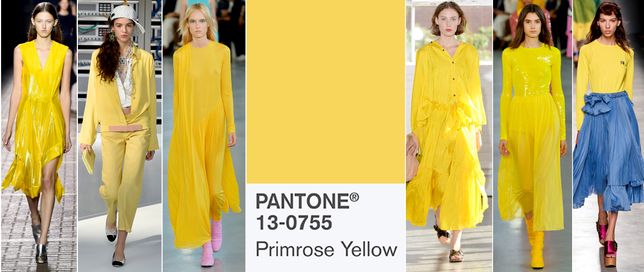
PANTONE 13-0755 Primrose Yellow
Can be considered as the contrast to Niagara blue. It is a sparkling yellow which brings the joyful early spring days. It reminds us the cheerful sunny days full of joy and vitality.

PANTONE 19-4045 Lapis Blue
Another energetic tone is Lapis Blue. It has the color of one of my favorite semi-precious stones, lapis lazuli. It is vibrant blue shade which transmit strength and confidence.


PANTONE 17-1462 Flame
Every season must have a red. In this case, it is an orange-based red or according to PANTONE a red- based orange. Flame is a lovely color representing summer heat and adding vibe and intensity to our clothes.

PANTONE 14-4620 Island Paradise
Island Paradise is a refreshing blue – green shade that reflects the need to scape to paradise islands where transparent and crystalline waters invite us to relax.


PANTONE 13-1404 Pale Dogwood
Another relaxing shade is Pale Dogwood describe as soft pink related to healthy glow and clarity. The softness of the color matches with Flame and black. A total look in this shade results girly and romantic.


PANTONE 15-0343 Greenery
A refreshing green connected with the leaves in spring when nature rebirths after the long cold winter. The shade infuses us with vitality and energy as well as with the need of exploring and reinventing our clothes and who know maybe our lives.


PANTONE 17-2034 Pink Yarrow
A vibrant and joyful pink could be the best description for Pink Yarrow. It reflects the intensity of the roses in blossom infusing a cute feminine touch to our looks.


PANTONE 18-0107 Kale
This green reminds us the green leaves in spring connecting again to nature but in a quieter mood if comparing to Greenery. Nature fertilizes in spring and a new natural cycle begins, so this dry and relaxing shade can be used as neutral for pastel looks combined with Pale Dogwood, Hazel and Paradise Blue or as a contrast with Primrose Yellow.


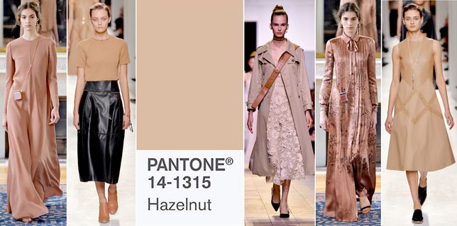
PANTONE 14-1315 Hazelnut
To finish we have the neutralest color in spring 2017 palette. It relates to the rich earthy tones adding natural and effortless notes to our wardrobe. It can be the passpartout in the palette and even though a transition color connecting all the seasons.