Pantone colour gurus have released their seasonal color trends for spring/summer 2018 and as it happened last season they have divided it into London and New York editions. So today we will be focussed on New York and in future post you will have London´s review.

In any case, the trend continues with bold and vibrant tones like Greenery last season full of joy and cheerfulness. This color trend forecast includes the four classic colors, which transcend seasons and provide structure to all wardrobes. Even this will be fashionable tones, as consumers and different individuals we should not be limited to use only these colors; therefore, this post is only a guide, never an imposition.
With this said, let´s begin to our color review.
Meadowlark

This vivid yellowish shade is an example of the joy that spring transmits once winter is over. It is a bright yellow that lights up our wardrobe. It could be useful to accesorize and for those who dare a head to toe meadowlark outfit could be interesting.

Little Boy Blue
 Inspired in spring clear skies, Little Boy Blue is an azre blue. This shade is a suggestive contrast to the energetic tomato red.
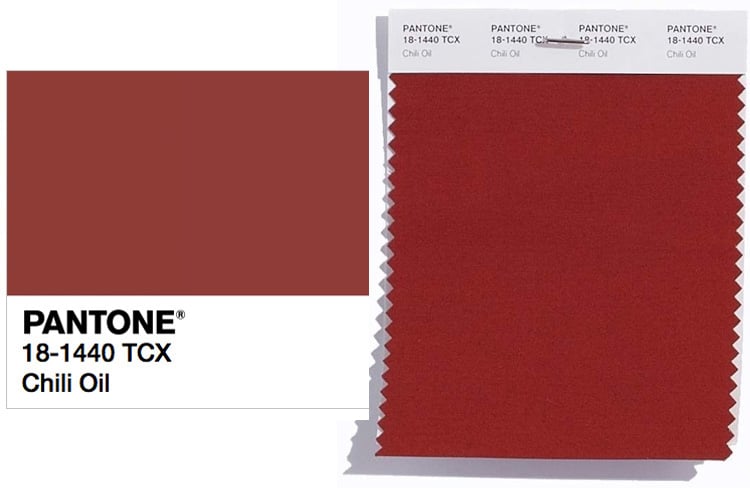
This spicy earthy brown contains a red base adding taste and definition to the spring 2018 palette.
Pink Lavender
Pastels are also included in the Spring 2018 Pantone color trend list. And this Pink Lavender covers the softness and the romantic side of the palette. This light violet rose transmits peace and relax.

Blooming Dahlia
Another floral tone to illuminate the spring wardrobe. A delicate color to be incoporated to our closet. With Pink Lavender completes thelight rose pink spectrum of the palette.
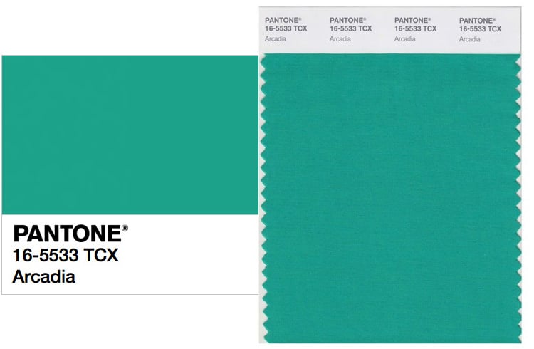
Conbining retro and modern vibes we have this cool green, Arcadia. Arcadia shows a blue base which reminds the fresh lacustrine waters.
Ultra Violet
Declared the color of the year, Ultra Violet is a complex purple tone which offers a combination of magic charm and originality. A colorful definition for 2018.

Emperador
This rich chocolate brown Emperador is a different color for a spring palette but adds earthy power and energy to the most vibrant shades.
Another ethereal, tender and gentle tone which reminds to the spring blossom flowers. A nostalgic and romantic tone for our wardrobe.
Spring Crocus
A smart and vibrant fuchsia is included in our pantone. For sure this will be one of my favourite shes as it looks flamboyant as well as gracious.
Lime Punch
Another acid tone for the spring palette. This radiant citrus shade will strike our closet with light and happiness.
Cherry Tomato

Another tone on the happy and hot side of the pallete is the cherry tomato wich is a red with an oragery base which shows energy and catches all eyes on it.


Merry Christmas beautiful 🎅🏻❣️🎅🏻❣️🎅🏻❣️🎅🏻❣️🎅🏻❣️🎅🏻❣️🎅🏻❣️🎅🏻❣️🎅🏻❣️🎅🏻❣️🎅🏻❣️🎅🏻❣️🎅🏻
LikeLike
Felicisimas Navidades. Me encanta tu blog y tu estilo.
LikeLiked by 1 person
LikeLike
Bright cherry red is definitely a must…
LikeLike
For sure it is my favorite shade as well as the violet and the fuchsia. Thanks a lot for your comment
LikeLike